
When choosing a college or university, students literally choose their second home. The home-like feeling should start directly at the higher ed website’s homepage! But how to achieve this?
We have listed elements of a successful homepage for websites in general, but today let’s focus specifically on college and university homepage design trends. They show what is needed to make your university homepage more engaging and user-friendly for your students (as well as alumni, parents, teachers, and staff, since they are also key audiences).
This post will be useful to you if you plan a website redesign or optimization in this area or want to create a new website for your higher ed institution. Our story will be accompanied by some beautiful university homepage design examples.
Key design trends for higher education homepages
Visualization elements for university homepages
High-quality visualization elements give your prospective students a chance to imagine themselves living there. They can highlight the key aspects of university life. This is achieved through videos, images, virtual tours, and more.
University videos on the homepage
Thanks to their great visualization power, videos are highly popular university homepage elements. However, remember website accessibility practices in design. According to these, you need to give your users the control to stop the multimedia and resume it.
See examples of videos at Bucknell University, Brown University, and John Hopkins University homepages that have this control button, although by default the videos are autoplaying. They contain no sound, and Bucknell University also displays a notice of this fact.


Invitations to take a virtual tour of a university
A 360 virtual tour is able to take your students to your campus with a snap of a finger. That’s why higher education homepages often have a link inviting everyone to a tour like this.
See how this is done at the University of Houston and Juniata College, which have a series of 360 virtual tours grouped around particular places and topics. Their tours have stop/play and audio on/off controls, an option to view the accessibility version, and more.


Image slideshows & carousels on the university homepage
Combining multiple large images in a slideshow is a popular design trend for hi-ed homepages. Make sure the most important image comes first by default — many users may not rotate the slideshow manually, and you may not want to use the autorotation for accessibility reasons.
See example in the University of Chicago and Northland College homepage design. The slideshows do not autoplay and offer manual rotation control instead.


Clear and prominent calls-to-action
Among homepage design elements for colleges and universities, CTA buttons play a major role. They catch the visitors’ attention, make it clear what you want them to do, and encourage action.
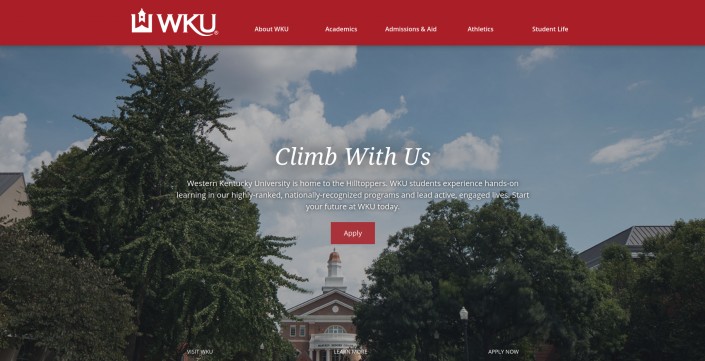
The typical calls-to-action for college and university homepages are “Apply,” “Give,” and “Visit.” They should be simple and visually prominent. See the examples on the Western Kentucky Universityand Juniata College homepages. The latter has CTA buttons, even for offering videos and slideshows (everything is under the full control of the user).

Higher ed homepage has simple and helpful navigation
The primary menu of your higher ed homepage shouldn’t be confusing. It’s better to keep within5-8 primary categories about the most important things (admission, key programs, etc.).
You can also provide quick access to important pages by means of UI design elements, and make sure they have descriptive labels. See, for example, how Lenoir-Rhyne University provides this with the help of handy buttons.

Menu division by the audience
Offering different options to different audiences is one of the ways to keep the primary navigation simple, avoid clutter, and deliver highly-tailored content quickly to everyone.
Universities have distinctly divided audiences, so another popular design trend for homepages in higher ed is to offer them separate points of entry. See, for example, how the University of Alabama’s homepage offers menu sections for Students, Faculty & Staff, Alumni, and Visitors.

Higher ed institution news on the homepage
Let your users feel the beat of your college or university life through the news. This section can have a minimalistic design or a creative approach — like this example from Murray State University.

Let us help you follow college and university homepage design trends!
We have outlined the basic design trends for higher education homepages. However, there are many other interesting ideas to consider when optimizing or building a hi-ed website. Our creative designers are ready to discuss them specifically for your project.
We have a successful case of higher education website development, showcasing our expertise in creating impactful, user-friendly platforms tailored for universities and educational institutions. Our experience has equipped us to handle the unique challenges of higher education websites, from intuitive navigation and accessible content to an engaging design that reflects the institution’s values.
When we are talking about design, we also never forget about the technical aspects. Your higher ed homepage should be made mobile-friendly (for example, by means of responsive web design), and have a fast performance.
For any questions and ideas, contact our web development and design agency!


